
Case study
AV WORKS
Brand Guidelines & Identity System
- Brand Identity
- Brand Guidelines
- Design System
Built as a system from the start.
AV WORKS was developed as a system rather than a collection of isolated visual elements.
The identity is structured around geometry, proportion, hierarchy and controlled repetition, creating a framework that can remain consistent across brand, print and digital applications.
We don't decorate.We define structure.
We don't chase trends.We build systems that last.
Design concept
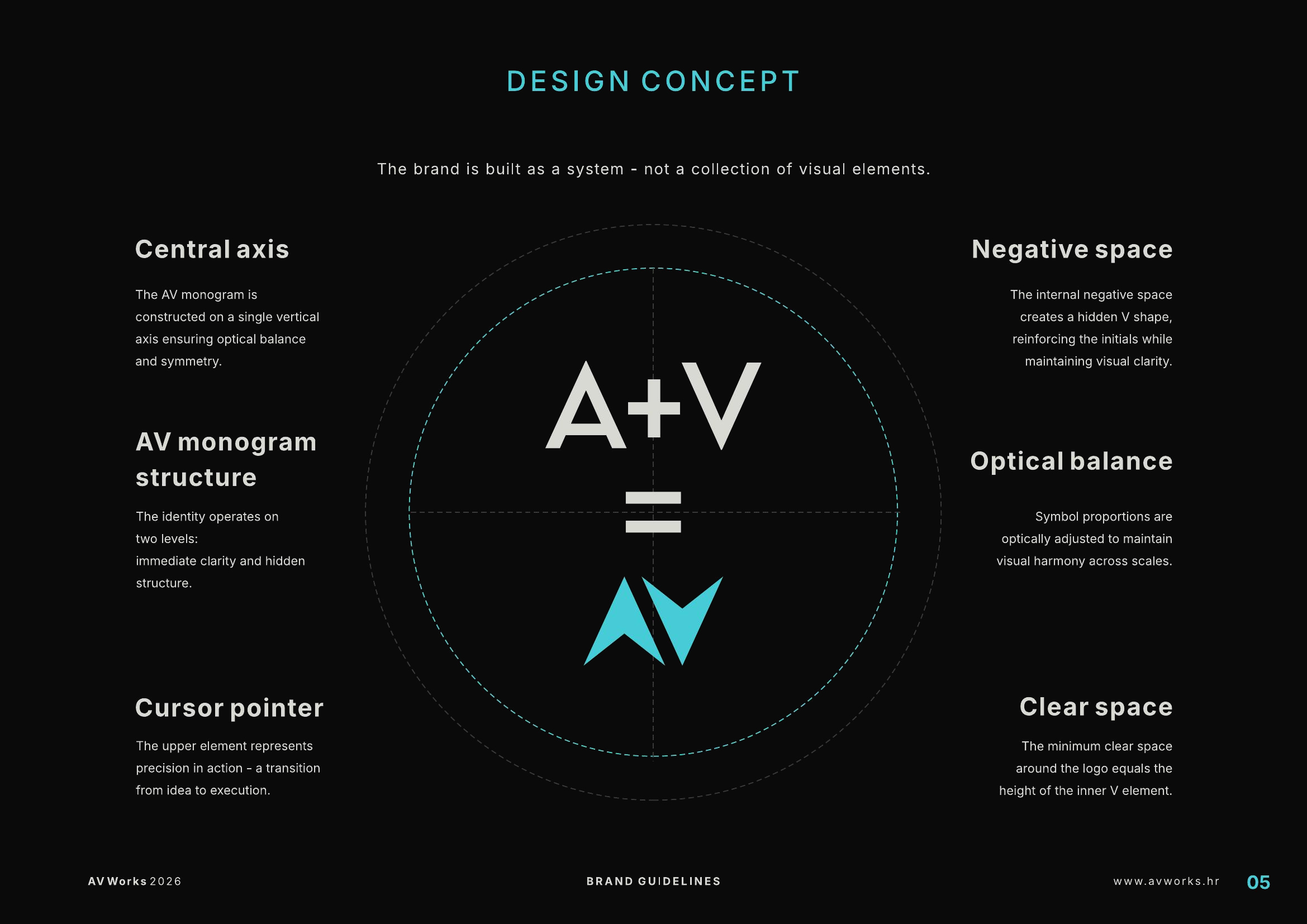
The identity begins with a central structural logic.
Axis, negative space, optical balance and the relationship between A and V establish the foundation from which the wider system develops.
Identity construction
One logic.Multiple expressions.
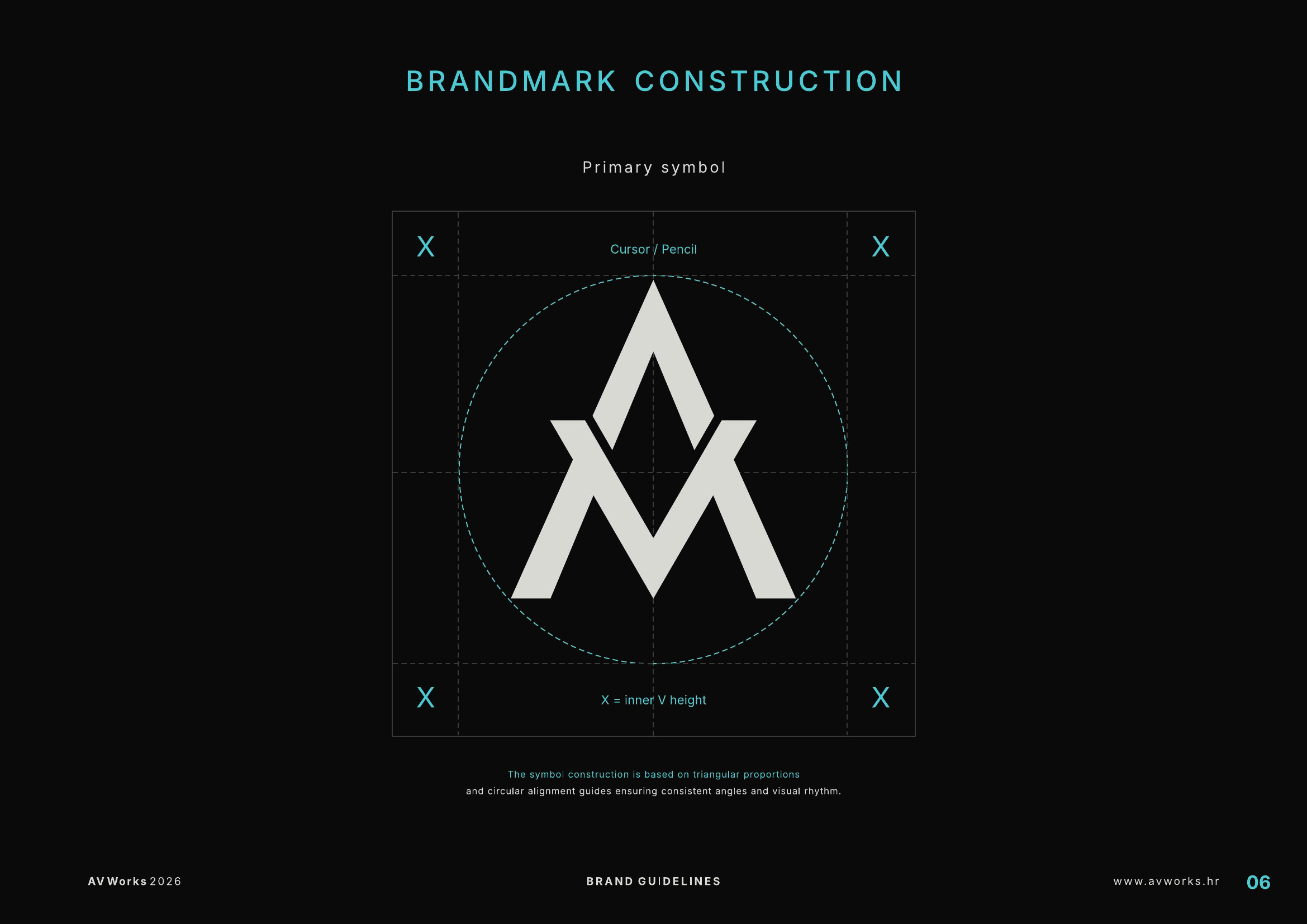
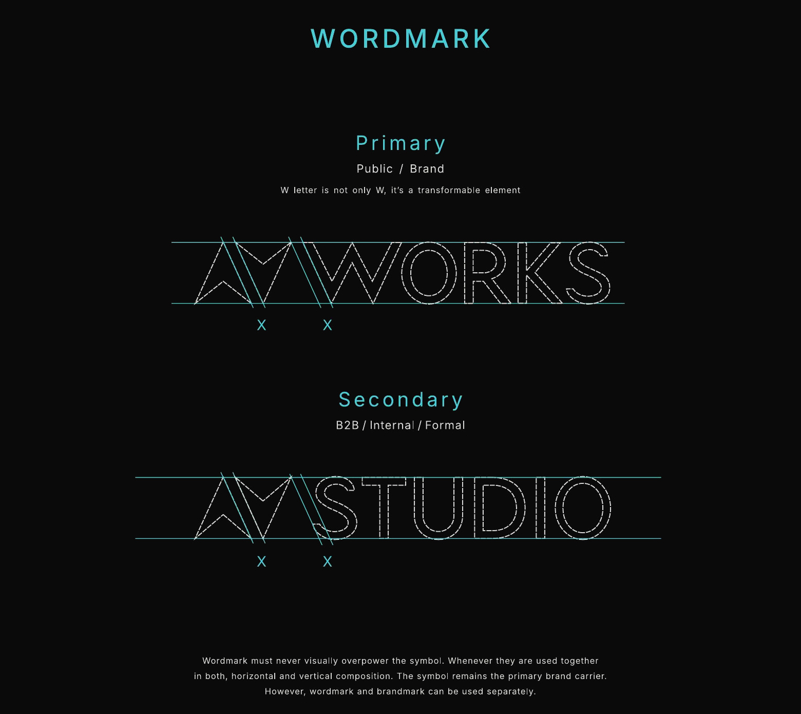
The symbol and wordmark are not separate stylistic decisions.
Both are governed by proportion, alignment and repeatable spatial relationships, allowing the identity to remain coherent across different compositions.
Visual language
Clarity before decoration.
Colour and typography reinforce the same principle as the symbol: controlled hierarchy, limited variation and functional consistency.
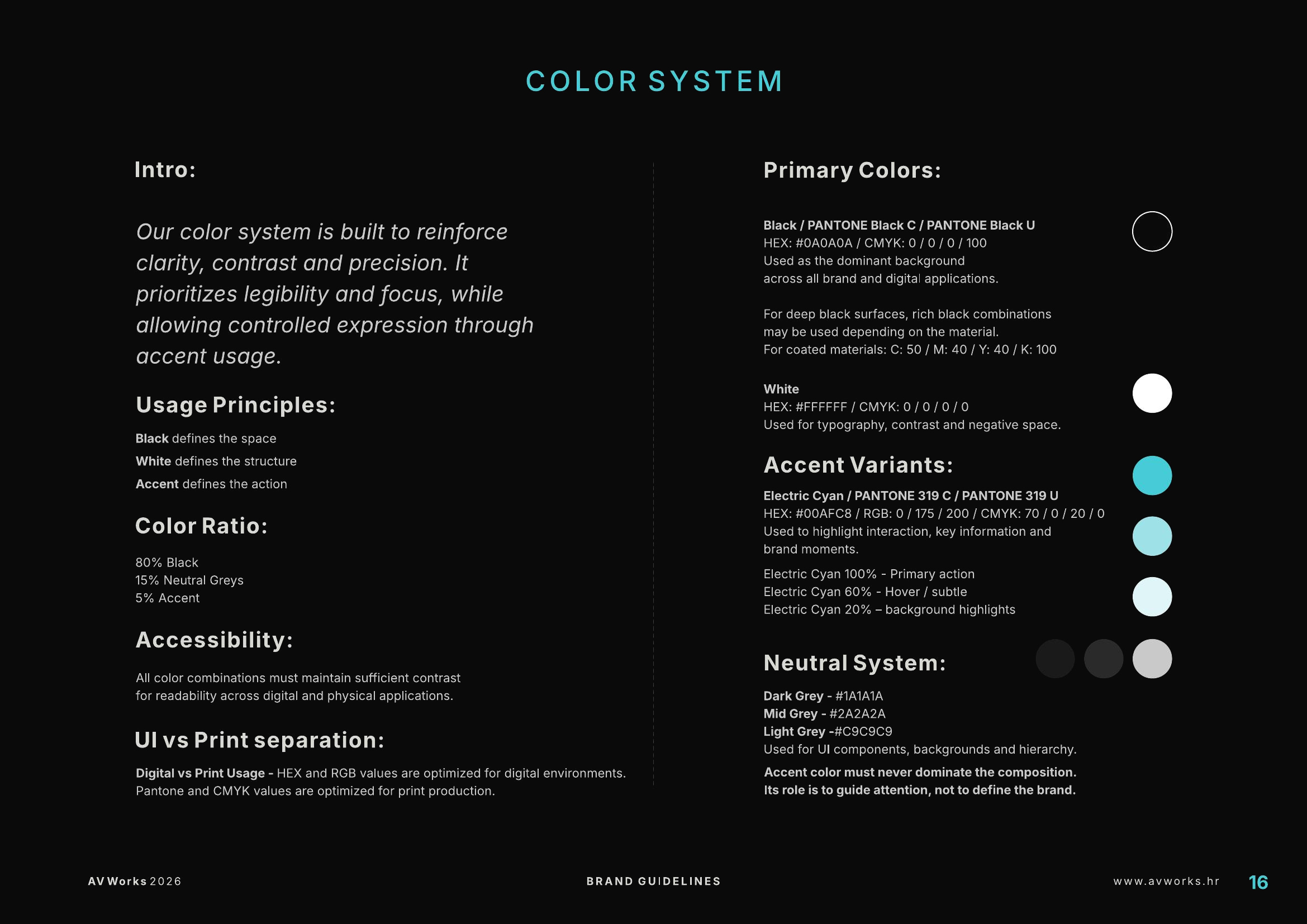
01Colour
The palette is intentionally restrained.
Black and white provide the structural base, while cyan functions as a controlled accent for interaction, hierarchy and emphasis.
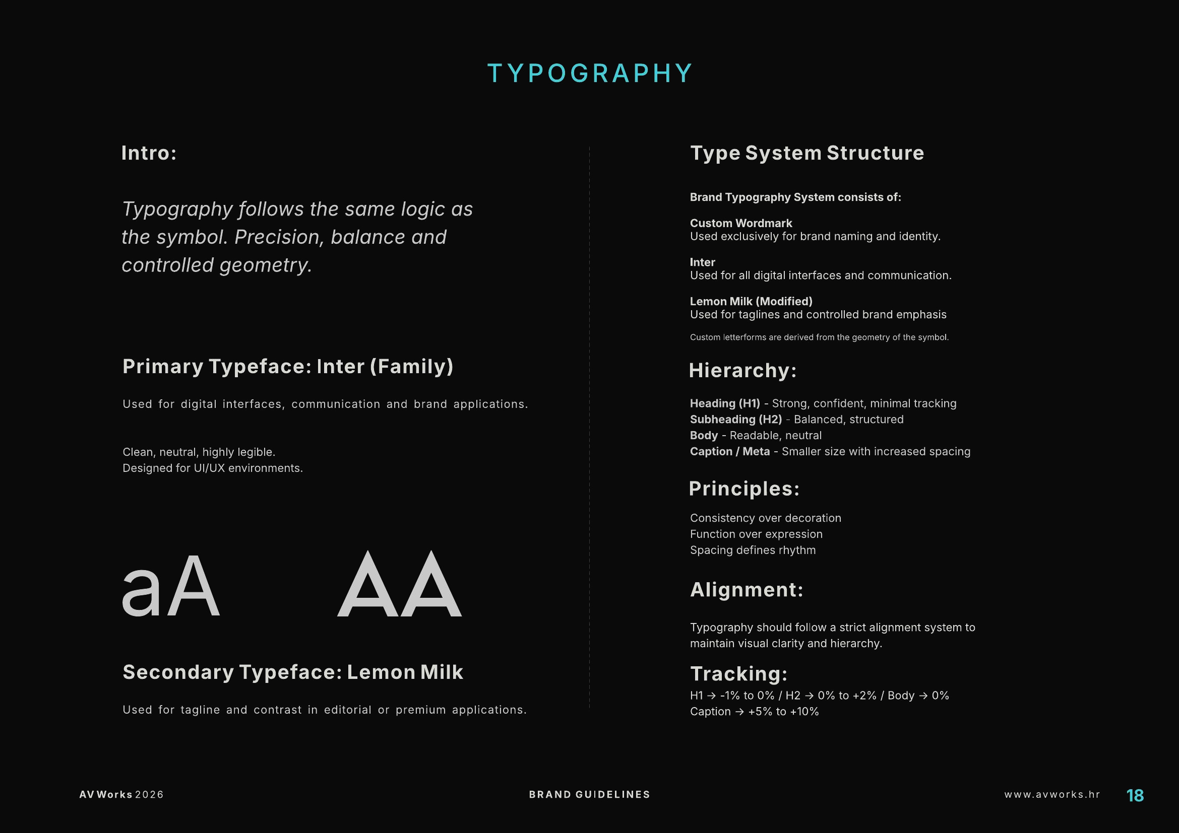
02Typography
Typography follows the same system logic.
Hierarchy, spacing and alignment are defined to support clarity rather than visual noise.
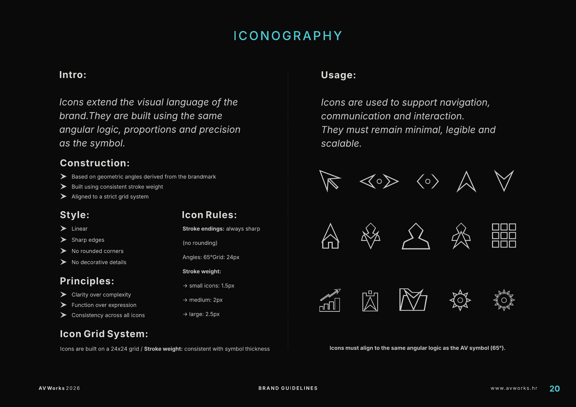
Iconography
The geometry does not stop at the logo.
The icon system extends the angular logic of the AV WORKS identity into functional communication.
Consistency is maintained through shared geometry, sharp endings, controlled stroke weight and a common grid.
Function over expression.
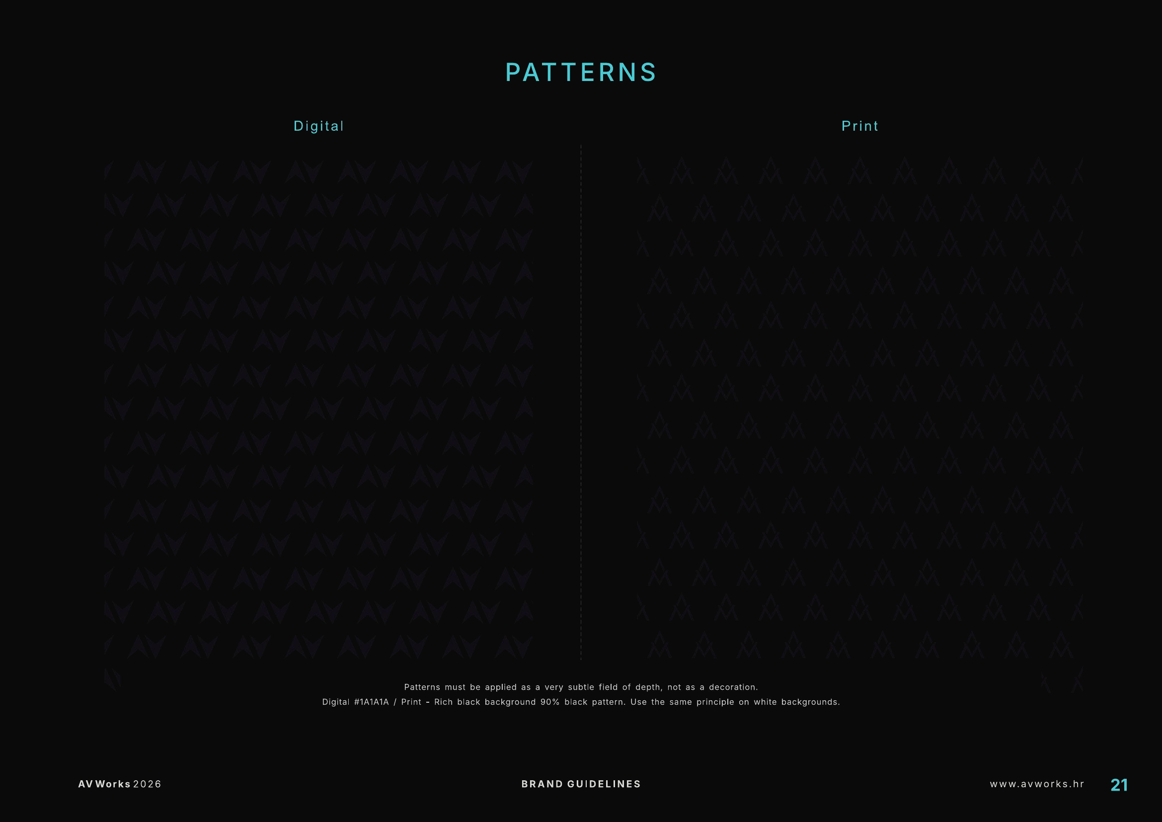
Pattern system
The core symbol also becomes a secondary visual language.
Controlled repetition allows the identity to create texture and continuity without introducing unrelated decorative elements.
System in use
Consistency has to survive application.
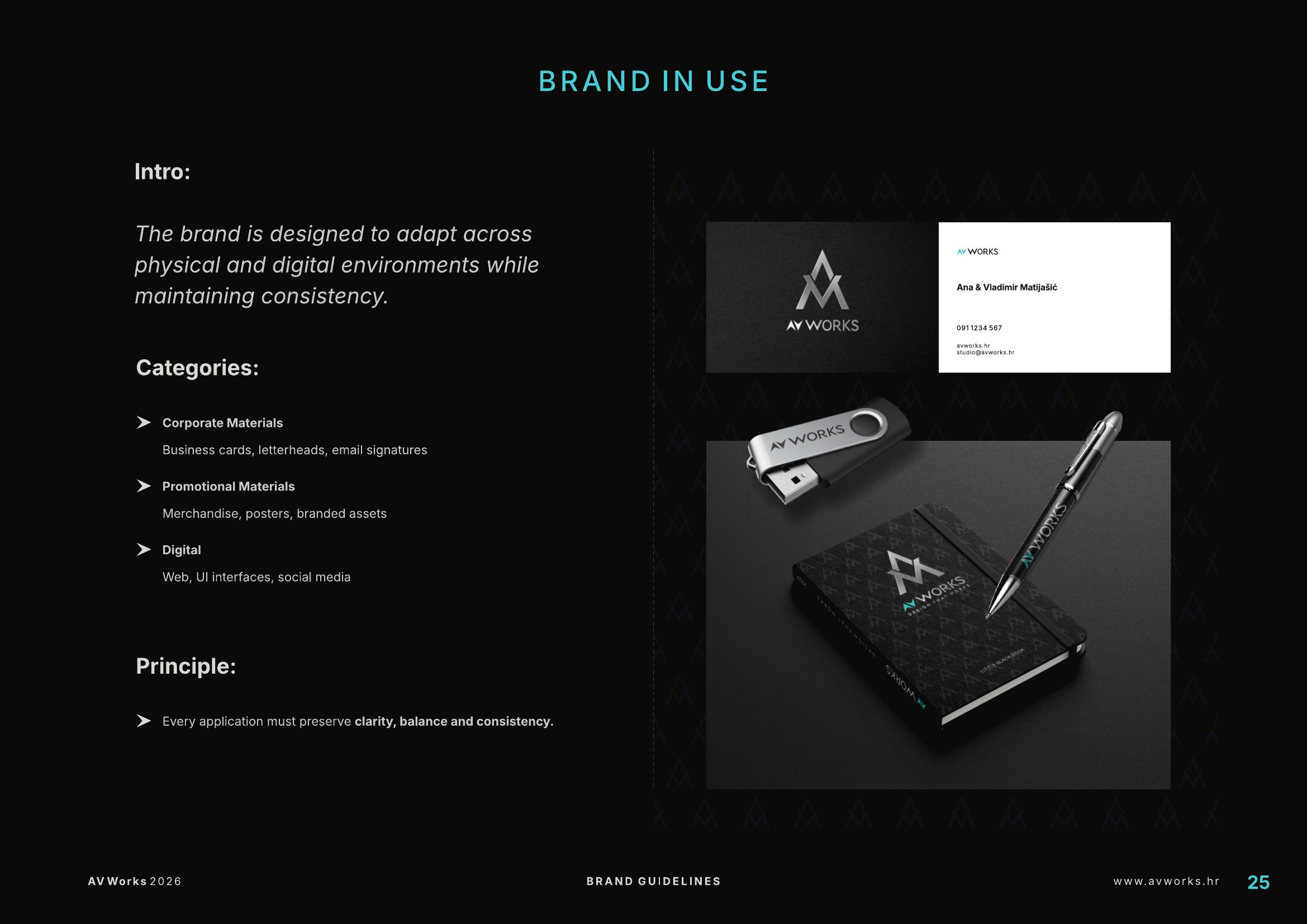
The identity system is designed to move across physical and digital environments while preserving hierarchy, balance and recognisability.
The objective is not to make every application identical.
The objective is to ensure that every application clearly belongs to the same system.
Brand principles
The system is governed by a small set of principles that guide decisions beyond individual applications.
Consistency over novelty.
We build systems that perform.
Design is the visible layer.