
Case study
Jaguar
Jaguar Beverage Company
- Brand Reframing
- Beverage Identity
- Packaging System
Context
From heritage to next generation.
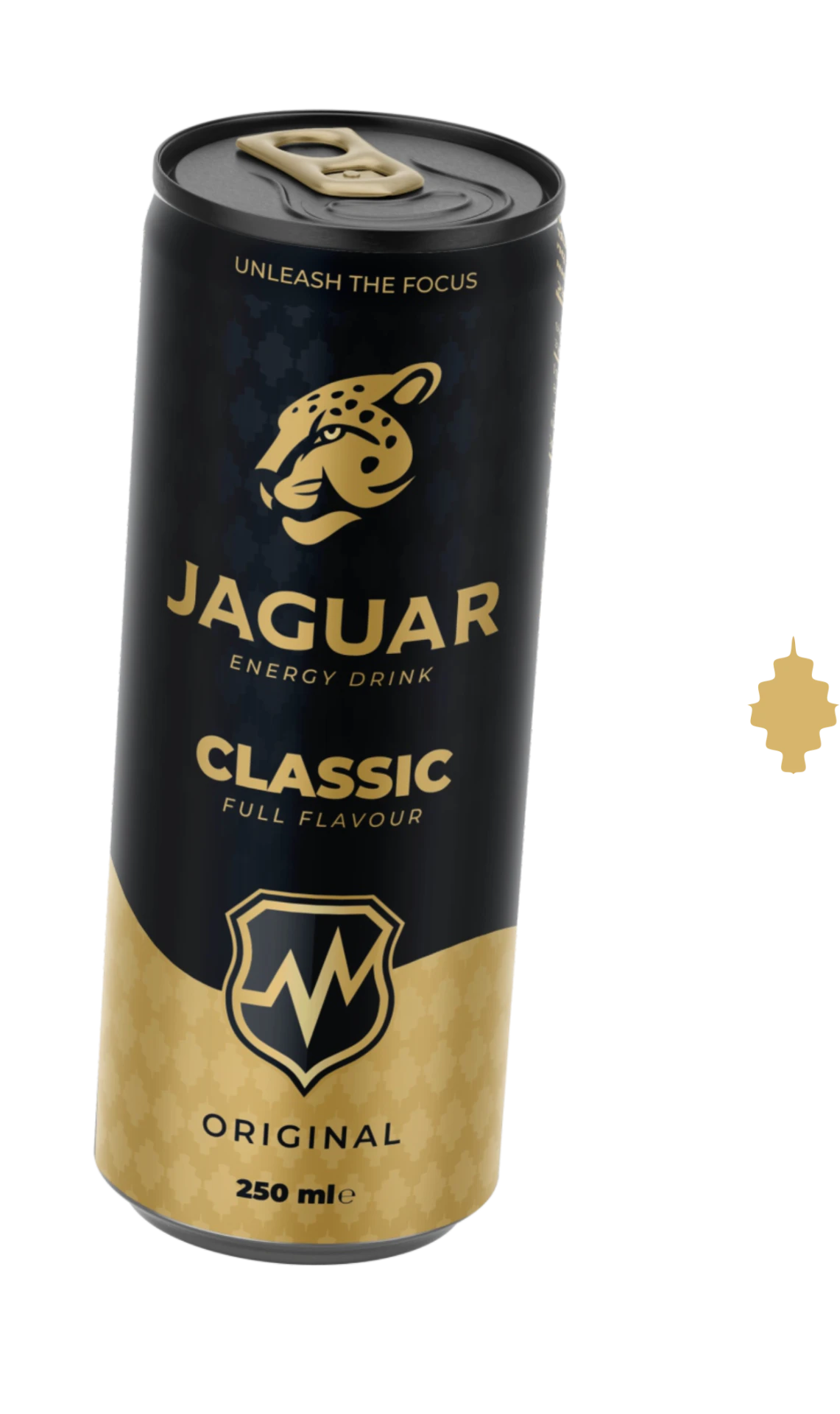
Jaguar Beverage Company required a reframe of its identity and packaging presence.
The objective was not to discard recognition, but to rebuild the brand with more clarity, stronger visual control and a more structured premium expression.
The work focused on identity, packaging language and a system that could hold together across product variants and brand applications.
What existed
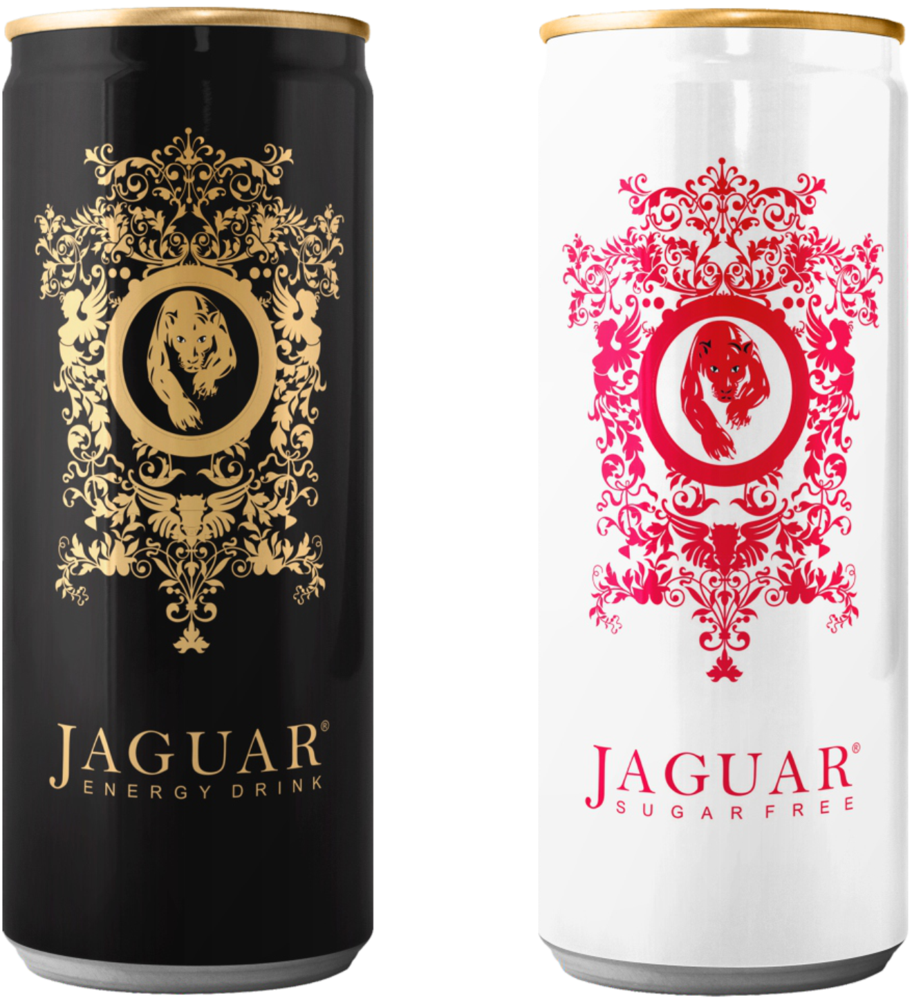
The starting point showed a brand with recognisable elements, but without enough structure or visual discipline to perform consistently.
The challenge was not only aesthetic.
The identity needed stronger definition, clearer hierarchy and a more controlled packaging presence.
A stronger structure was needed.
Early exploration
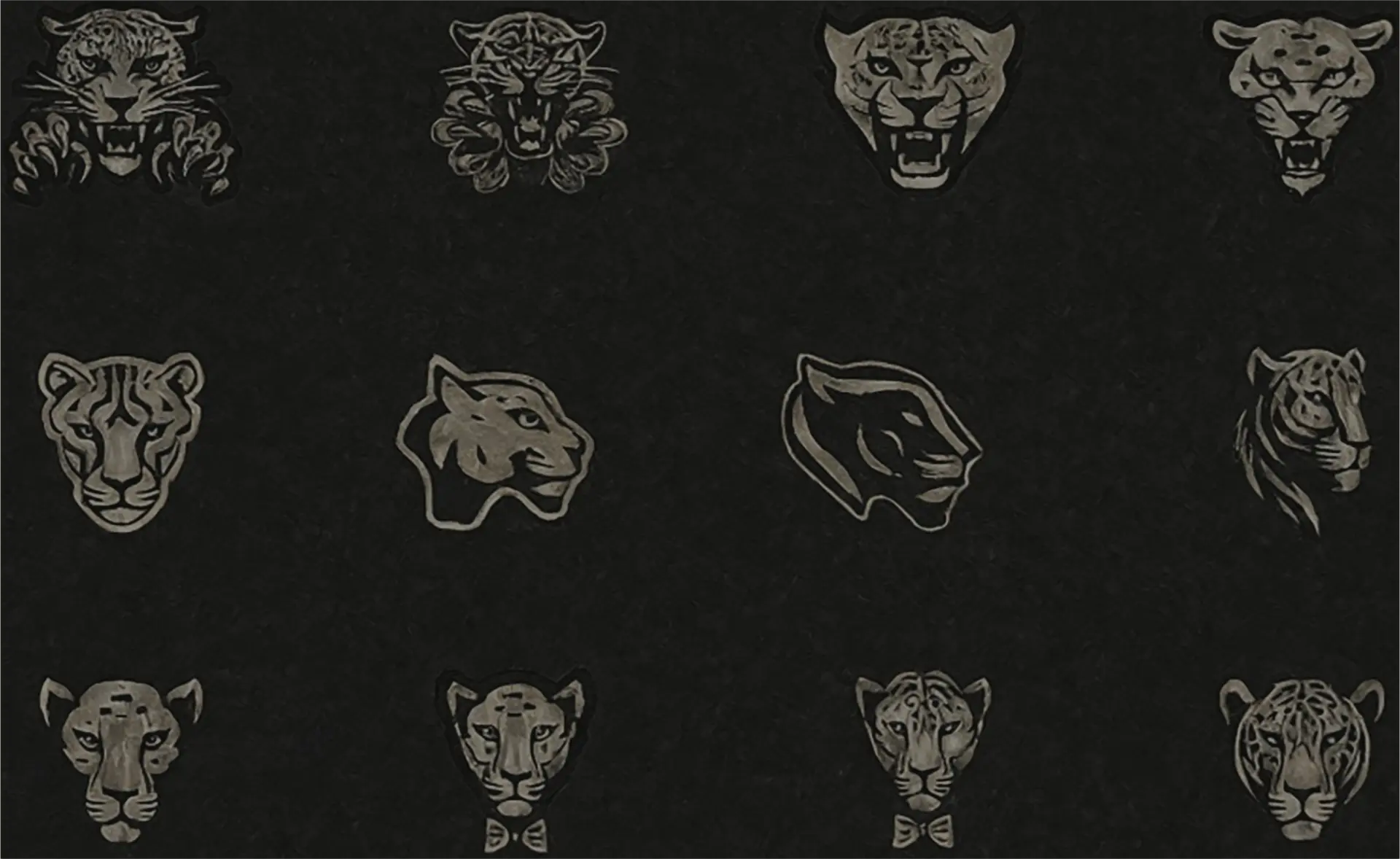
The early phase focused on reduction, proportion and recognisability.
Rather than decorating the brand, the process explored how to sharpen its character and build a more stable foundation for the full identity system.
Identity system
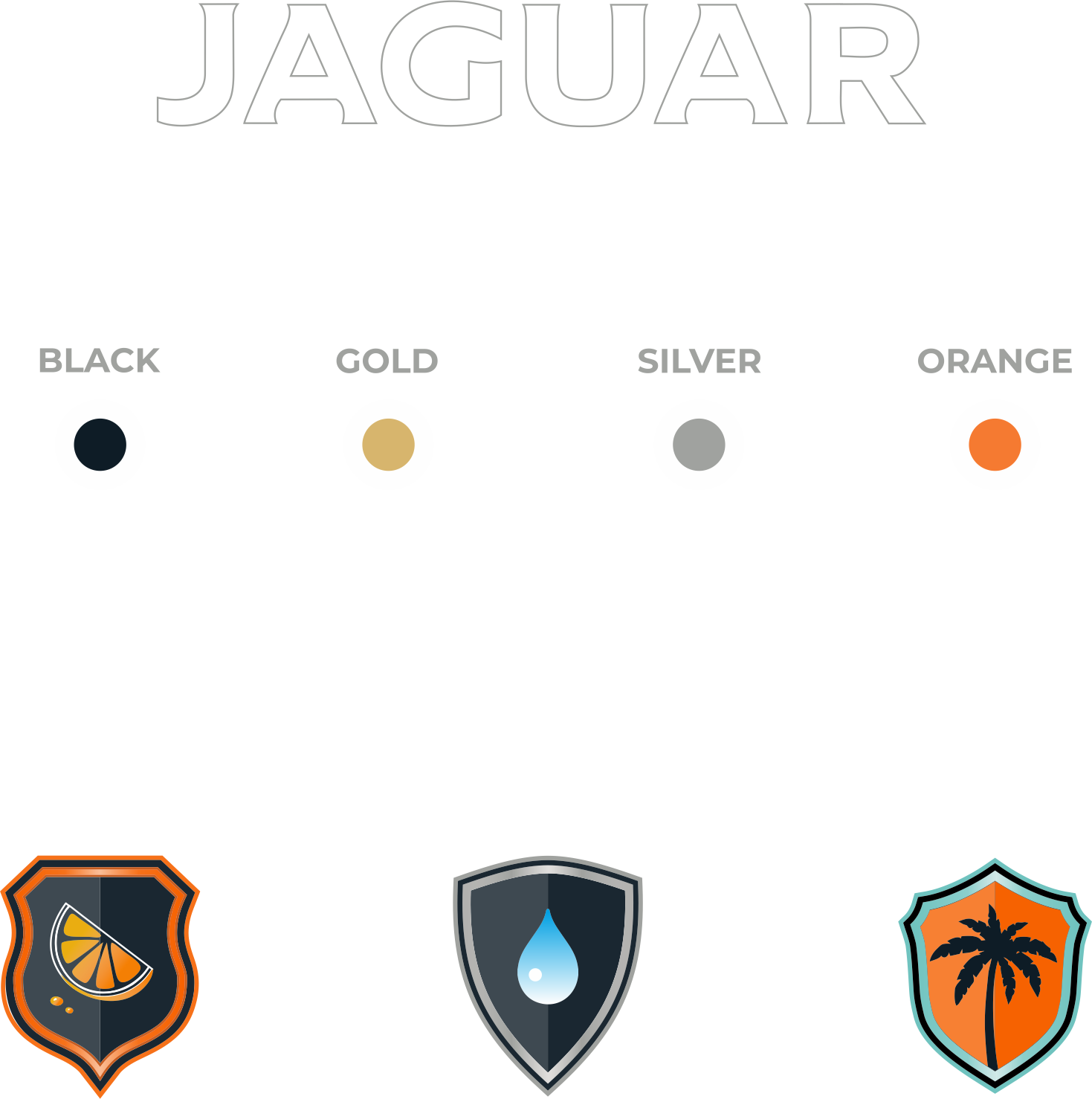
The identity system establishes a clearer visual architecture.
It defines how the symbol, logotype and supporting brand elements work together as one controlled structure rather than as isolated graphic parts.
The result is a more confident and scalable foundation for future applications.
Packaging direction
The packaging direction was built around contrast, restraint and controlled differentiation.
A dark base creates presence and consistency, while selective colour shifts allow the range to adapt without losing integrity.
01Gold on black
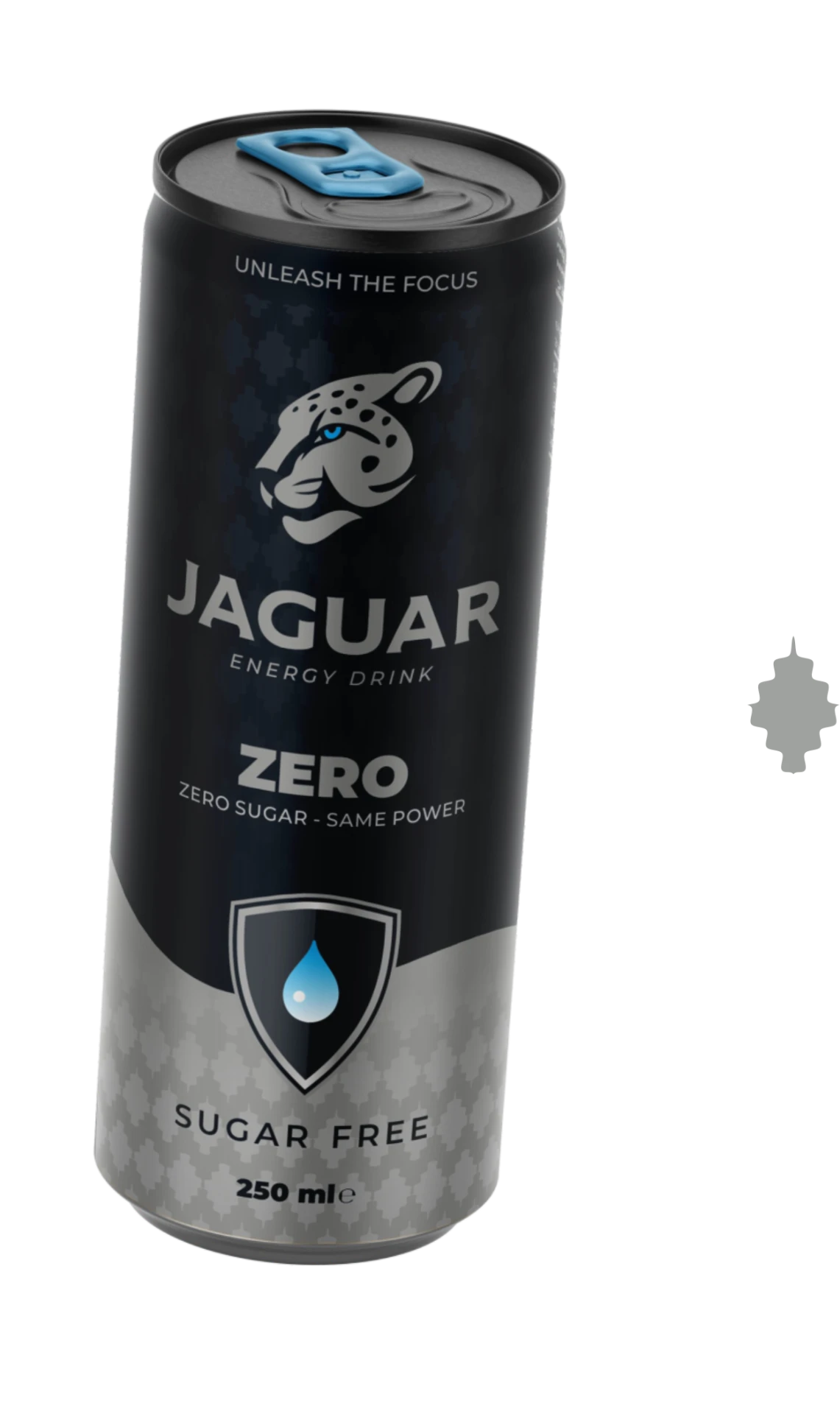
02Silver on black
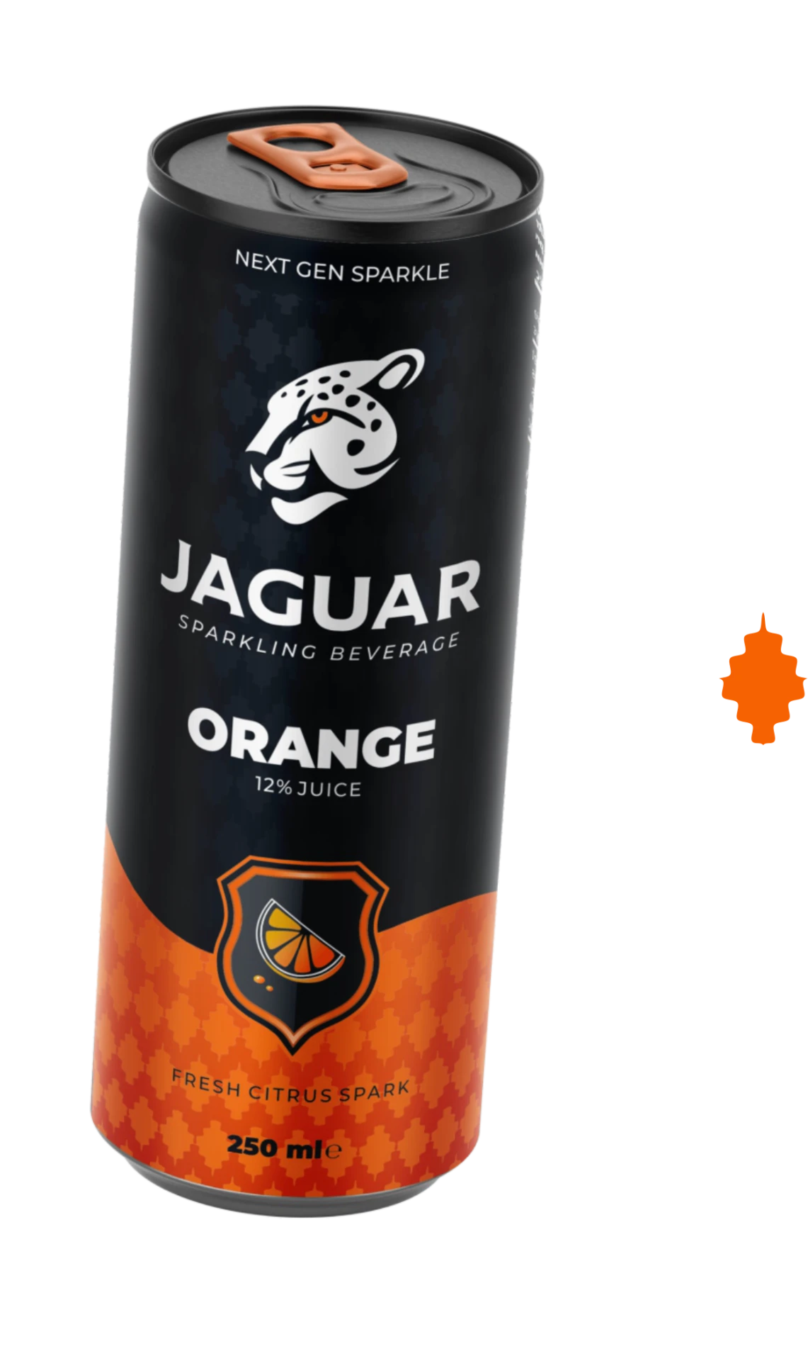
03Orange on black
Variation works best when the structure stays constant.
Family line
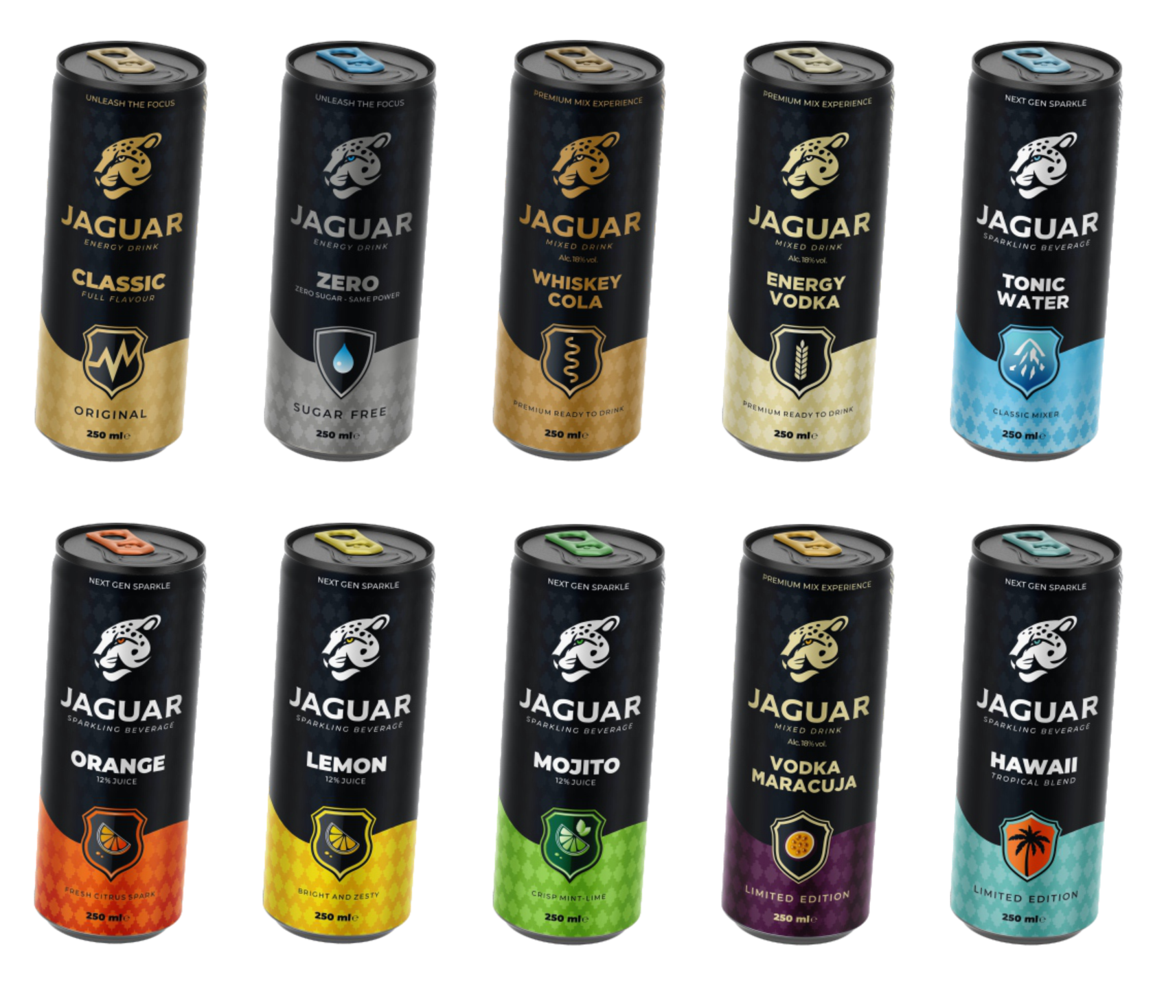
The system was developed to work across a broader family rather than a single isolated product.
This allows the brand to extend while maintaining recognition, consistency and a controlled premium tone across the range.
System extension
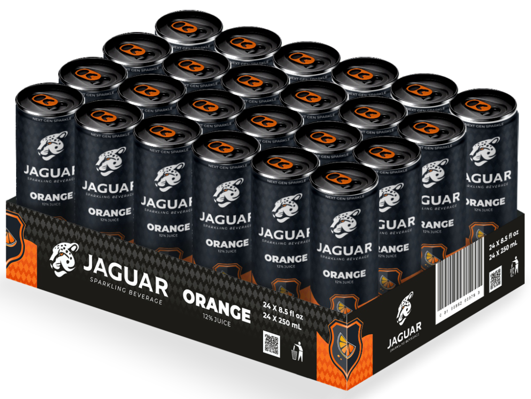
The packaging system extends beyond the primary pack.
Tray application carries the same hierarchy and visual discipline into secondary packaging, helping the brand hold together across production and display environments.
The same identity logic also supports brand presence in space.
Applied to a trade booth environment, the system moves from packaging into presentation without losing coherence.
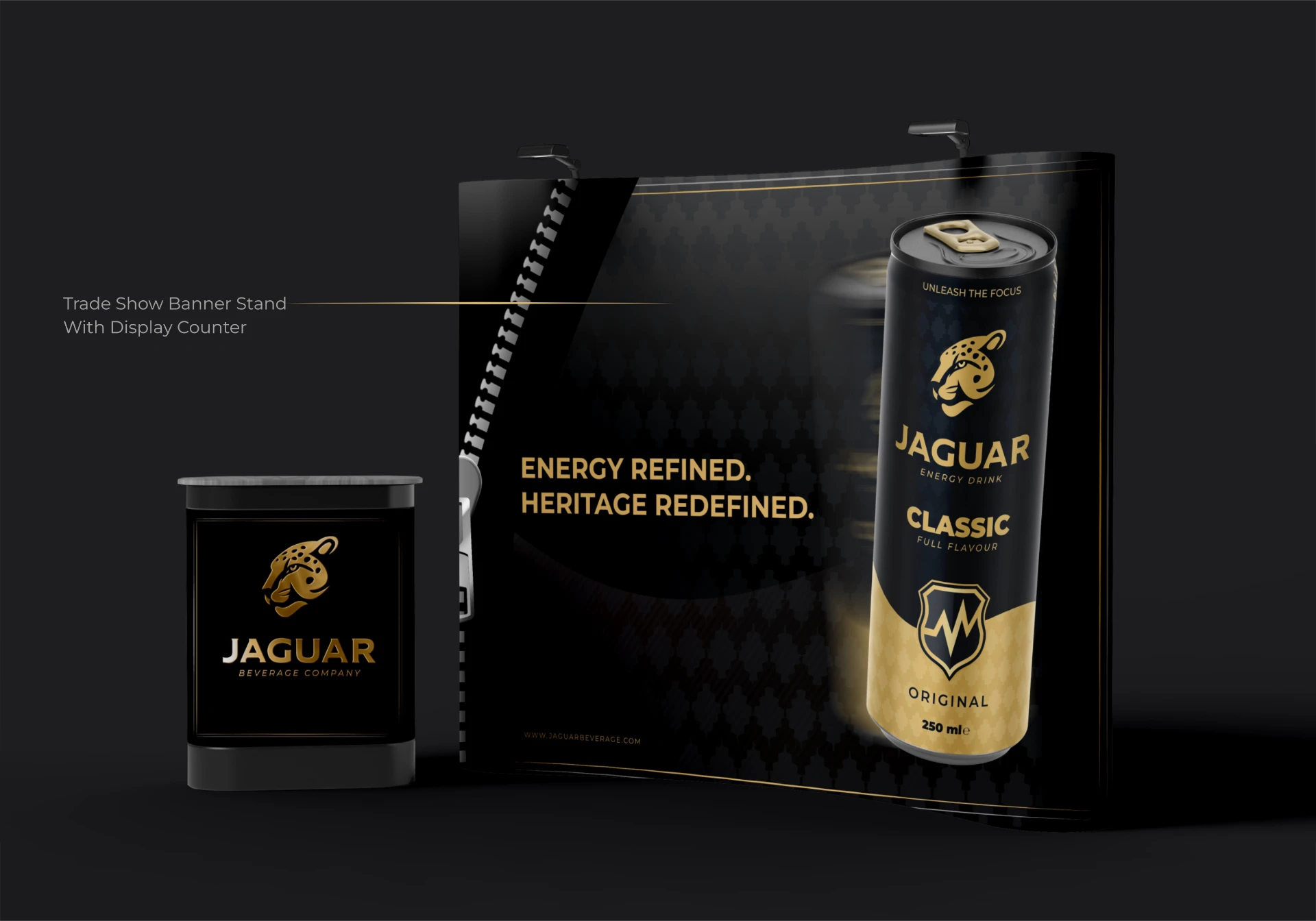
The system scales across touchpoints.
Outcome
A clearer brand with a stronger system.
The resulting structure supports clearer recognition, more controlled application and a stronger visual presence across brand and packaging touchpoints.
- 01Improved visual clarity
- 02Stronger brand recognition
- 03More controlled packaging expression
- 04Better system consistency
- 05Clearer extension across applications
Identity as a system.
Built for recognition, control and extension.